#studying texture and how to render things...
Explore tagged Tumblr posts
Visit Tumblr Blog
Explore Tumblr blogs with no restrictions, modern design and the best experience.
Last Seen Tumblr Blogs


Fun Fact
Tumblr Inc. has $15.1M in annual revenue.
Text

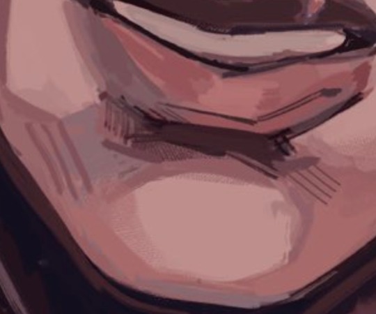
Finished :D
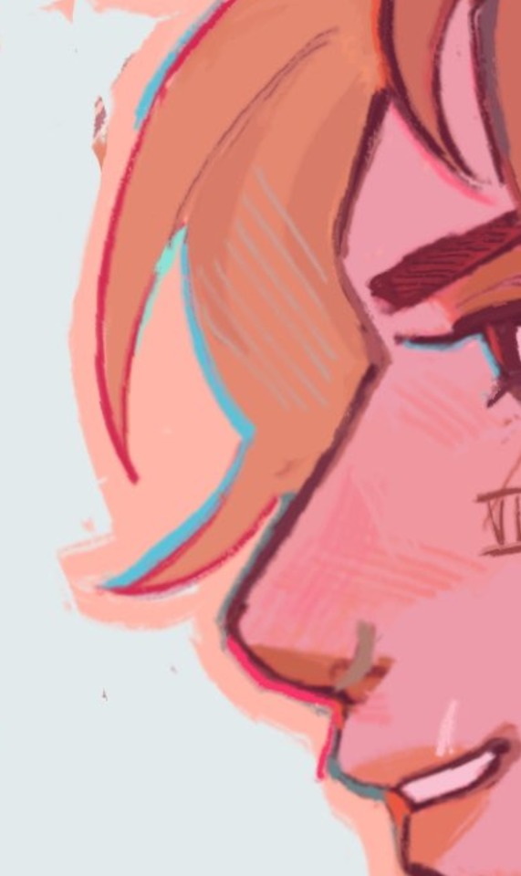
#Let me know if you want to learn about the process for this one#full disclosure: I roughly traced my reference image#because I didn't want to hold myself back with anatomy and proportions when all I wanted to do for this was studying colour#and trying to find the right colour balance#studying texture and how to render things...#I really like how this turned out!#I have a few more leyendecker studies planned but this is finished for now#malevolent podcast#digital art#artists on tumblr#malevolent#arthur lester#arthur lester malevolent
1K notes
·
View notes
Text
There's a lot of things I wanna improve with my art IN THEORY but at some point I got so tired of trying and "failing" to learn certain skills that the mere thought of actually DOING it makes me wanna throw my drawing tablet against the wall. I need to fix that
#isa barks#like i want to learn how to draw environments and improve my rendering and texture and all of that#but i'm so terrified of any perceived failure that i feel like i can't leave my comfort zone anymore#even tho when i was younger i was much more willing to at least try doing an environment or scene or something#even if it didn't turn out exactly how i wanted it#and i know it helped me improve! there's a few older pieces that i looks back on and am still very proud of!#but i just don't do that anymore. i'm sticking to just character drawings and it's not really helping#i think part of it too is feeling like i don't have the time or energy to put into it#the idea of drawing a big piece with a background more complex than a gradient with a few shapes feels like too much right now#i wanna have fun and broaden my horizons but if i take too long my brain will start hating everything abt it#i feel like that happens with my writing too in a way. and writing always takes a long time for me so#anyway. yeah#eventually i want to take some time and find a resource for learning these sorts of things that's easy enough for me to understand#and actually sit down and practice stuff and study artists i admire and like. actually learn new things#i just wish i wasn't so exhausted all the time
3 notes
·
View notes
Text

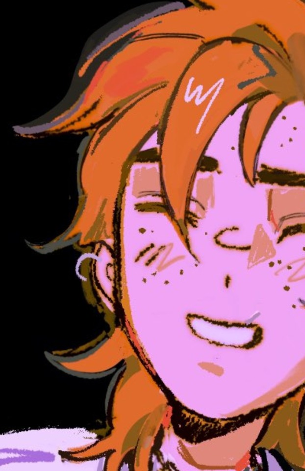
I'm getting my practice in drawing skulls with cotl drawings lol!! overall this was really fun and took like 11 hrs ish
probably expect more cotl bc it has me in a chokehold- it's great, though, bc ots helping me overcome this strange inability I have to make art for things om passionate abt?? idk I usually chicken out when drawing for games I like but so far haven't with cotl so progress!!! :D
(ramble warning bc the only thing that stops me yapping are word limits :] )
I started then restarted this drawing bc this pose was just rlly perfect but I'm quite happy with how this came out! I tried to find as many excuses to put bells on the lamb as possible- I kinda feel like bc they aren't very sneaky in the game, might as well make them be as shiny and loud when walking as possible :D also I just rlly like shading gold, and red - the cape was so funny had some iddues wirh the face - had redid ot a few times and settled with that one- it's alright I can live with it, I was initially worried?? abt the hair since I'm not used to drawing more textured hair types- something I absolutely need to study but I think it didn't end up terrible, albeit bc I added so much glow to it u cab really see any rendering, woops 🫣🫣🫣 the candles were a lat min addition as it looked too empty and boring - they were hard and a bit of a slog to draw eughh also, somehow, I managed to forget the red crown!!! for 10!!! hours!!! literally how finally sparkles everywhere bc reasons
1K notes
·
View notes
Note
https://www.tumblr.com/bigmammallama5/732632789726478336?source=share do you have any tips on how to detect ai and deepfakes?
Good question and I'm gonna be honest, it's not always easy and it will only get harder and harder. I'm just an artist who has spent their personal time to dive into this topic and study images. I'm still learning and there is a lot I don't know. But let me show what I know. This will be long, but I will make a summary at the end! So far, even with ai having become better and better there are still almost always some things wrong with an image, and they all have a very specific look to them. So let me try to show you some and point out some of them.
As we all know, a biggest struggle ai had were hands. And even though here and there we still see messed up hands, I say "had", because the hands is actual a good example on how ai is improving and will only get better. Still, looking at pictures that show more hands is always worth it, because somewhere in the back there will be most likely at least one messed up hand.
Another issue a lot of ai still has is hair though!
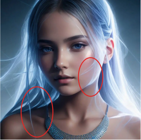
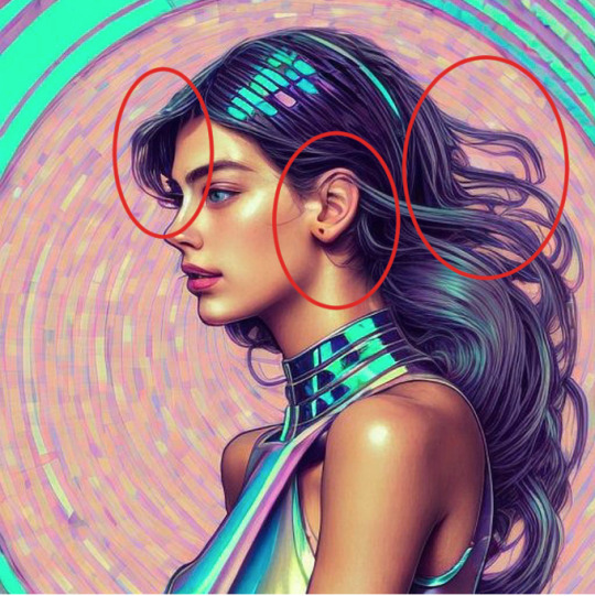

It's very obvious still in many ai "drawings" and in those otherwise well rendered portraits. Hair starts to blend with the ears a lot, or with the clothes.
There is also often this very odd look between something too sharp and way too blurry

There is often a very specific texture to the hair. I actually do not know the artistic or specific name for it. I can only describe it as this weird sharp feeling that makes it look oddly pixely, and then you have areas where it's very blurry. And the kind of loops and almost flame like looking hair we see in the last pic out of the three here is also something very common with ai.
As an artist I know we make mistakes too! The way I draw hair is flawed too! But it's not only that it's flawed here, but it's following always the same pattern and falls into the same issues over and over again, no matter who is "creating" the image. Those flame like loops are a common one, next to the odd blends and weird sharp and blurry textures.
But ai is getting better, and we not only have "art" and something that tries to be a drawing/painting, but photos too.

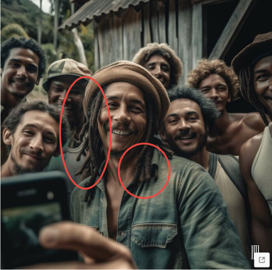
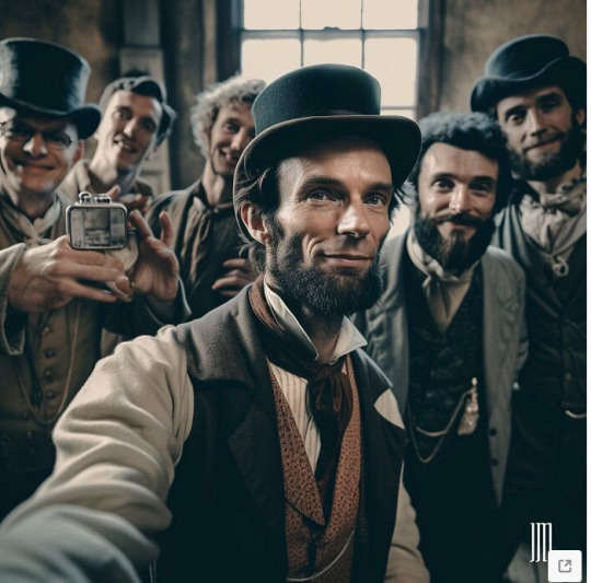

A lot of those "photos" have a very specific texture and look to them! Again, it's not always the mistakes, but the very specific optic too. A lot of the images are oddly smooth, too rendered, with always blurry backgrounds. And when you look closer at the background you will see the mistakes! The crowd behind Jesus is a hot mess once you look closer. Bob Marley's hair has the same issue than I described before. Lincoln is surrounded by people with messed up hands and don't even get me started on the faces behind Caesar.
So a lot of ai images look alright on a first and quick glance, but as more time you spend with them, as more mistakes you will notice. The wehre is Waldo of ai horror.
And those "photos" shared here are still very obvious. Not just the mistakes and messed up details but the very specific aesthetic too.
Those images get better and better and as less details you have, as less mistakes you have!

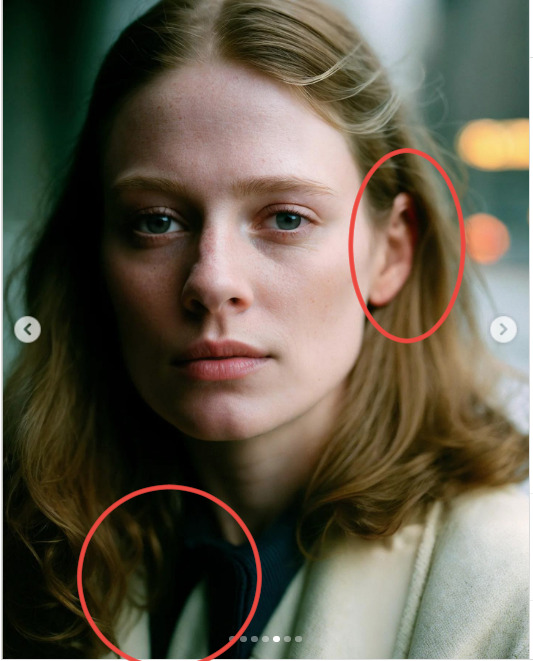
With photos like this it becomes harder and harder. There are not many details and no hands. Not many mistakes can be made. Also the very obvious plastic looking smoothness isn't so much here anymore. It kinda still is...but differently. And always the blurry background!! Sometimes the hair is still a giveaway. Collars and clothe straps are also often still a giveaway upon close look. As is jewelry. Earrings will be different and necklaces often don't go all the way around, just end, or blend with the hair or clothes.
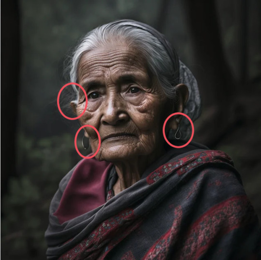

Often details on jewelry is also blurry and not shown properly. This is a trick with many details. With jewelry, batches, hair, ears, text. So it's often blurred out and not shown properly because ai doesn't know what to really show here.


It's often really just the small details and when we scroll down quickly we will miss them. Like the wedding ring on the middle finger, the pens on top of a closed pocket, the batches that are always blurry, messed up faces that blend with a blurry background.
And sometimes it's so subtle that I could only really tell that right is the ai image in comparison to the real photo on the left. The real photo shows hands clearly and even when things are blurred out it doesn't feel that it's done to hide things. The ai image on the right hides the hands. There is also a very dead look in the eyes :D

And here I could only tell because the text in the back doesn't make sense. Even blurred out we should be able to make out something here

And after seeing a lot of ai images I recognize the kind of blurred out bg in combination with a very smooth and well rendered foreground/characters.
And here the only giveaway is a closer look at the backgrounds as well

To summarize it:
Ai and fake news rely on a fast living world. We are being bombarded with tons of information and messages daily and we scroll past quickly. But the best tool, for now, in detecting ai is taking our time! Those images get better and better but so far there are still always some things off!! Especially in the background!
Hair. Often weirdly smoothed out and oddly sharp at the same time
Hair often blends with the ears or the clothes
Details are blurred out.
Jewelry doesn't match (example earrings). Details on metal often blurred out and never shown. Necklaces blend with hair or the clothes, and don't go around the neck.
Background is always blurred out.
In this blurred mess there are often hidden very messed up faces and/or hands.
A very specific smooth and yet too sharp/too rendered aesthetic combines with an always blurry bg.
Text, especialyl in the background, is not legible and doesn't make sense.
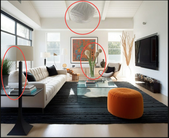
Backgrounds are often (so far) the dead giveaway. Somewhere in the back things become muddled and messed up. This shows also very well in ai decor/architecture. There will be odd lines that don't align or align too well. Curtain poles that end in the furniture, a plant that is behind a lamp suddenly having leaves in front of the lamp. As longer you look as more you will notice.
Conclusion:
Take your time with images! Sit with them! Especially when it's framed as important and political news. Is it ai and propaganda, or did it really happen? Don't fall for the quick buzz and outrage! Some things are obvious right away but with others you have to take your time. And it's time you have! If you are still unsure if a pic is real or not, do some research on top. Image reverse search. Can you find it anywhere else? Are other news outlets sharing it? Does the image/message make sense? For example there is now a deepfake of Bella Hadid voicing support for Israel. Ask yourself, does this make sense? If it feels out of line compared to previous behavior, do some research! Media literacy is not just as being able to recognize a fake or real right away, but being able to do research. To question things! Don't just take every post online for face value. Even when shared by a mutual you trust. They might have been tricked!
There are so many information online and it's great to have access to so information, but it's also difficult to wade through all of it. Media and truth are a weapon and it's being twisted and bend used to manipulate. Always has! But ai and so many people being able to post and share things, it becomes bigger and bigger and more dangerous. So don't just take everything that is handed to you and share it further no questions asked. Media literacy and being able to think for ourselves and do the research is important!! And as research becomes harder and harder, as sources are being messed up with ai and other fake news, it's even more important to sit with the images and study them. See the flaws, the mistakes. Compare it to other news and images.
This got long, and I started to ramble at the end. Sorry But I hope this helped
#text#ai#how to detect ai#danger of ai#ai images#fake news#amalas talks#anon ask#fake images#how to tell ai#long text#long post
6K notes
·
View notes
Text
god this is so overdue. im finally making a bg3 side blog
for a first post i wanted to list some of the artists i've been (mostly) refraining from reblogging to main for many months at this point. i meant to only do my favorite few but then i couldn't decide who my favorite few were so... here you go
@meanbossart draws absolutely beautiful art of his absolutely beautiful du drow, and also has an amazingly well-written and well-characterized story about what he, astarion, and shadowheart get up to post-game
@kawareo goes deep how his durge strike suffers from both the urge and orin's attack, and into strike before orin's attack. i love the standalone art and comics, so when i say his writing is my favorite thing he's done that's high praise
@velnna's tav staeve is another very pretty man and i don't know how to describe what i like most about his art other than "very pleasantly textured", it catches the eye in a very pleasing way
@lucklessrat has incredible dramatic and comedic timing in their comics of lethean, and i love what they do with leth being old. you don’t see that often
i have a soft spot for half-orcs and paladins so naturally i think about @everchased's finch constantly. they have several of my favorite bg3 comics ever but the SMITE one is... just gonna say i agree with astarion there
there is so much to say about @jeeaark's tav greygold, from the jokes to the relentless optimism to the visceral (in a very good way) art style, but my new favorite thing is the dark urge (godsdammit) companion series, it's really fun to see DUG and greygold interact and i can't wait for more. also, another half-orc!
@ejoym's durge devlin is wonderfully deranged, i love the dark humor in the comics, the art is really crisp, and the artist makes really great use of colors. i love how pointy everyone is also
@ohpsshaw's durge typhus is going through it at the moment. love his expressive face (and the expressiveness of the whole art style) and puppydog vibe, i can't wait to see how much he... enjoys... the rest of the game as daddy's chosen. also check out the artist's entertaining commentary on her main(?) blog
@taygra5shaon's big scary durge jacq somehow can do adorable and terrifying equally well, sometimes at the same time. this is another artist who has great timing in her comics. i especially like the young jacq ones.
@angiemaniac's tavella and durge companion au presents durge from a different and very interesting perspective. and she does a great job including every companion into the story, while tavella is still a compelling character on her own!
cae is the most beautiful durge you've ever seen and @hellothisisangle's art does such a good job of making him feel dangerous. it's incredibly beautifully rendered, the poses and fashion are always amazing, and on top of it all cae's lore is fascinating too
@wellen-katze's comics are really in a league of their own. their comics vary but my favorites are the ones that hurt to read. my favorite series is this one with ascended astarion and a nameless durge dealing with the tragic aftermath of the story. their comics hurt in an incredible way that i can't get enough of.
ghost, aka niro, by @oathbreakerapologist is wonderfully fucked up. he has a really upsetting presence (/positive) and i can't look away from his relationship with orin. this is probably the least sfw blog i'm linking, which i hope comes off as a complement
with @mistercrowbar's aldiirn it's hard to pinpoint specific things i like because the art and comics are so well-rounded, but if pressed i would point to aldiirn's visual design and the skill with which the artist makes his desire for approval and will to break the rules mesh together. i'm not sure if i want to be his friend or study him like a bug
i love @crocodiller's pining dumbass (affectionate) rowan so much. there's a lot to like about the comics but my favorite is rowan's supportive friendship with karlach. they're also very well-paced and some of the crispest art i've ever seen
i found @ryvenarts and sullen literally yesterday but i'm already very interested and excited to see if there will be more
another recent (to me) discovery, thirkuir by @jayfitzmaurice. i really like his design and the expressiveness of all the characters
@quess-art has an adorable baby durge who still has a compelling backstory i'm excited to see more of. plus the wagging tail is just perfect
@3eefstud's durge Einar is really nice to look at, with amazing colors and gradients. i'm surprised i didn't find them until very recently
i thought @panksage's Ebony Darkness D'urge was just a joke at first but no, the comics are sincere (and also funny) and just beautiful, especially the colors!
i do not know if @arianiziolek's durge has a name. catty little murder lizard (affectionate). has some of the funniest comics but more importantly the best durge facial expressions
@bajablast666 is double dipping with durges kaethan and kelrath. both their art and writing have an intensity that i love (the red outlines they use often are so good) and their writing in particular conveys emotion and visceral feeling so well
karl by @beltart is another on the surprisingly long list of people i initially found from their art, then read their writing and was blown away. i don't think i've seen anyone else depict the weight of the urge as intensely as this and i love it
and finally, a palate cleanser from all the durges, @wirywyrm's tav arthur who's in a sitcom as opposed to a horror story. i really like the texture and detail of their art and also how much of a dork arthur is. least smooth bard(adin) in the realms
incredibly i did leave out a few people, mostly people who draw companions rather than their tav/durge because i sort of locked myself into this format, so i may come back and update this later!
485 notes
·
View notes
Note
Please..please tell me how you got the small details and ability to draw cities in Spiderman fan art :(
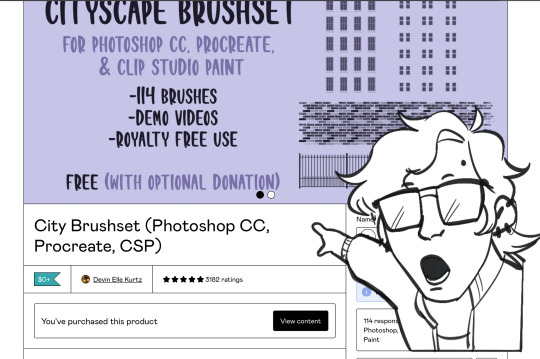
this is the brush pack i use for city backgrounds and textures a lot of the time ! it’s free on gumroad but i recommend donating to support the creator :)
drawing backgrounds is all about zooming out and focusing on big, important shapes and values no matter if it’s urban or suburban or mountains or the flaming pits of hell, so don’t focus on things like windows and small details until you’ve got good values and building shapes blocked in. ZOOM OUT AND USE GOOD BRUSHES ! dont render every leaf on every tree, and study from photos lots
466 notes
·
View notes
Note
Odd question, but when you're shading your pictures, where do you put the "true" color of whatever it is you're drawing? The parts that are in light are brighter than the original color and a bit of a different color, too, based on the source. The shadows are darker than the original color and more based on the undertones of the object/hair/skin or whatever, so also not the original color. I've noticed you have a kind of gradient between the colors to make them harsh but still blend together, too. Where does the shade you're basing these off of come in?
Sorry if this doesn't make sense 🙏 I'm trying to study art styles I like to figure out how to improve my own drawings, and your page is a huge inspiration for me.
Hmmm If I understand correctly, you're asking me why you can't color pick the base tones as shown below from anywhere in the picture, right?

That's because A) I know these colors, roughly, by heart. So, Instead of picking them from the original drawing, I did what I always do and selected them manually. But also - and what I think is actually relevant for your question: B) A lot of processing takes place OVER these base colors! Let me get the spherical piece of Bhaal's sacred flesh to explain.

Here we have just the base color by Itself. Next, I add a light wash of the undertone to places like the face, ears, hands - basically anywhere the body has a tendency to become flushed. The intensity of this depends on the person and skintone, and in DU drow's case I tend to make it pretty prominent.
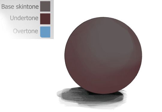
Next, I add the "overtone". I don't even know if that's the right term for it, but it's something that happens with very dark skintones because they tend to reflect more light. With my character, this color is almost always blue for stylistic reasons.

The base tone is still there, even though you probably couldn't easily color pick it anymore. It's doing it's quiet, thankless job: being a base!
As if that wasn't enough, out comes all the fancy stuff:

And I can get even sillier than this with more layers of shadows, multiple light sources, highlights, and so on. These colors here are just examples too - they can be pretty much anything in a similar level of brightness/contrast. All elements of the art that I want to render get this treatment or similar depending on their texture, not just the skin, so you can probably guess how they would get "lost" despite being used as a base.
Hopefully this clears things up!
694 notes
·
View notes
Note
Hiya Snippit! I absolutely adore your artwork, its such an inspiration to me!! Your colours, textures, and sheer energy and mood that you put into each work is absolutely fantastic!
I do have a question on how you make your backgrounds, whether it's a scene, abstract, or just atmospheric. I always seem to struggle with them myself, and I was wondering what tends to be your thought process for making them? Keep up the amazing work!!
Hiii thank you so much : D!!! Hmm i think what id reccomend is doing small color keys for stuff and using references : ]
for example- heres some styleframes for a student film ill possibly be developing and im basing it off deep sea photos

same goes for these color keys with moustache guy!! i took some reference photos of the nyc subway and some other metros, thought about how i want the tint change from pretty neutral to a ominous green
I think once you have a good color key you can think about the render,, James gurney has a really good book on color theory if you wanna check it out! also i am guilty of using overlays often, i used to think of it as cheating but now i think this is an aid and its here for me to use it as for other tips i reccomend drawing a grid and putting it in perspective, if theres a floor in your frame
you can delete it afterwards but it will help your brain on how to place things You can take it a step further if youre drawing an interior and draw a simple 2d room plan with a grid, stretch it in perspective and "extrude" it
Overall i also did a lot of studies so that mustve helped as well, if youre sitting in a place with your sketchbook, do a study of it! Pen and paper, its fun because you can look back atthem in a few years and remember how your room looked like or where youve been... Also if youre bored by studies you can draw them and put your character in them to make them feel more personal : ] Good luck!
168 notes
·
View notes
Note
could you share how you paint hair and skin? your art is so nice to look at
thank you so much!
maybe one day I'll make a more detailed post with screenshots as I render... but honestly my painting process is really pretty simple. I usually use a textured brush or something with hue jitter turned up 1-2% to put down base colours, and then I go in with a medium hard airbrush for shadows and for adding warmer colours where blood flows (nose, ears, cheek, around mouth sometimes, eyes).
after that i merge all my layers and basically draw on top of everything. bunch of refining details and texture and LOTS of cross hatching. hatching is a really good way to transition between colours i find!!
(another tip I use for skin rendering is adding gradients within shadows, anddd ofc I add hatching when I do that too)
I wish I could offer more technical advice but I really don't know what I'm doing in the slightest I just throw colours on there and hope for the best😭 I guess other good things to keep in mind for skin are the planes of the face (im rly bad at this one, but basically just look up planes of the face on pinterest and use that as a guide for shadows and form) as well as hard vs soft shadows!!
im also. Not good at this one. So don't take my word for it but i guess it's good to have a variety of shadows that end harshly vs shadows that are softer and blend in more? if that makes sense? you just need to think about 1. what is casting my shadow 2. what is it being cast on (or idk maybe its not. that's just kinda what I do) and render from there!
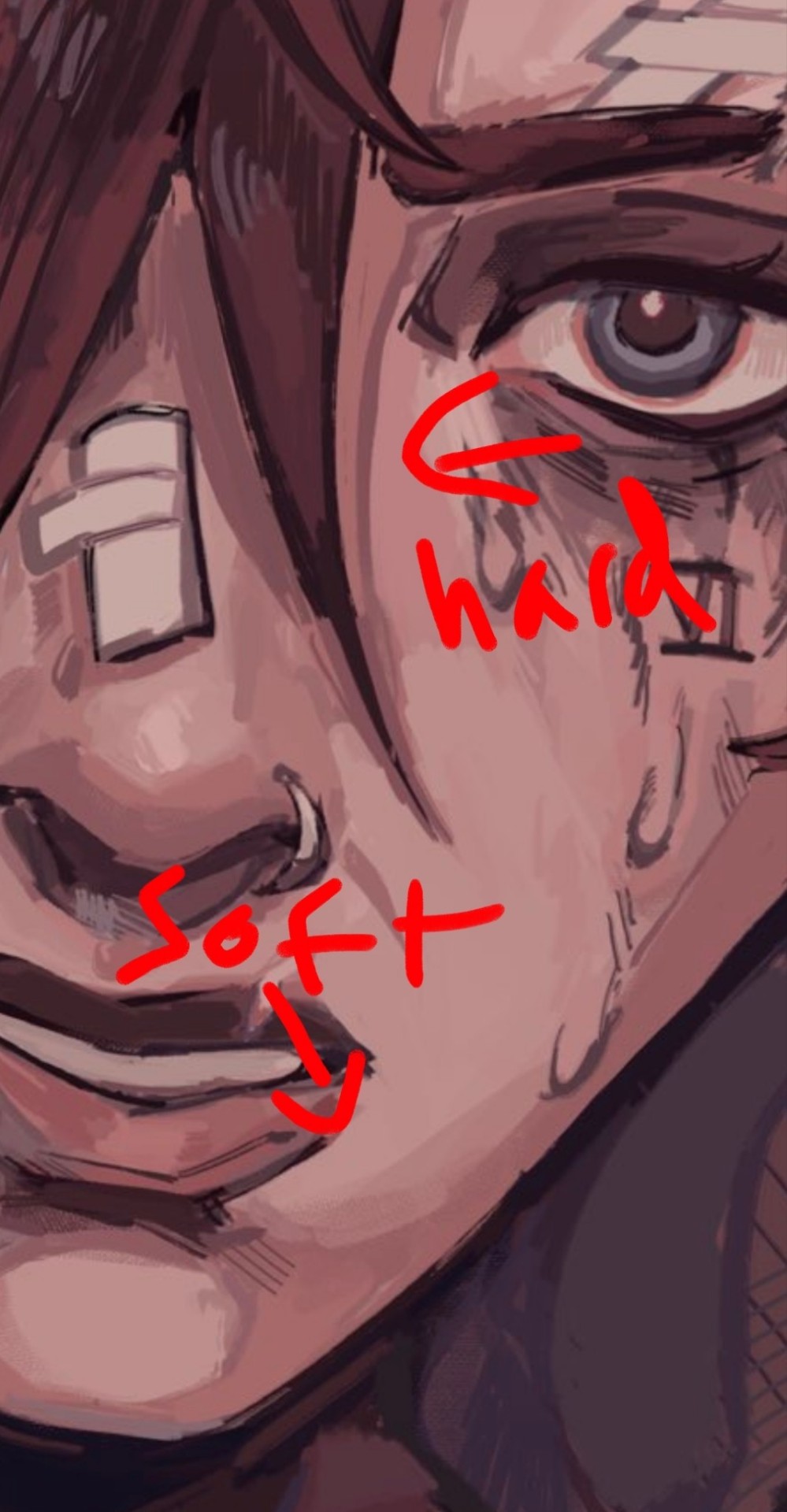
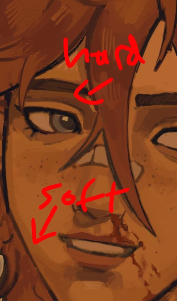
I like to outline my harsher shadows but thats rly just cause I love to outline everything. OOH THATS ANOTHER THING. use harmonious colours and outline shit it looks soooo good.
i do that shit all the time.Like don't be shy about grabbing colours that don't make sense being in your drawing. it's a drawing who gaf if vi arcane's hair is outlined in turquoise. NOBODY! and it looks fire!
for hair I just bullshit it and add hatching I really don't have a clue how to draw hair. I guess figure out where the hair strands are coming from and then draw them coming out from there (This is some real expert advice here damn) and then add shadows underneath the hair tuft clump things ?? no clue. someone make a tutorial for me im kinda the one that needs it in this situation.
uh I hope that helped at all!! Please watch YouTube videos and stuff by actual professionals take everything I say with a grain of salt because seriously I don't know how to do any of this I probably should study art more but I am LAZY
#art#digital art#art tutorial#painting tips#digital painting#art tips#tutorial#artist#ask#art advice
124 notes
·
View notes
Note
Hey, you're such a huge inspiration to me and I'm obsessed with your artstyle. I'm currently studying concept art and I want to learn/understand how to create form and lighting and genuinely how to start and finish an artwork. Do you have any speed paints or progress videos of your works? If so, I would love to understand your thinking process
Thx♥️♥️
hiiii
tysm!
big thing, concept art, my first inspirations in digital. Good luck!
Here is a look at the beginning of a work and the finish.. I have a youtube channel where I have uploaded full timelapse, but there is no recent I don't think there. The last timelapse from 2023? My YT is: nonnydoge
Set in the core of what you need to paint and then work at it. Simple. Jk it is not that simple but it is my thought😵💫
Light is your #1. Keep your light in mind always. When you are in control of your light, you are in control of your logic, then you are in control of your forms easily.
Looking down at a table and looking at side of the table will give you a different "color" of the table


yeah these are not the same table but I am too lazy to open blender rn. But you will get the same effect in variable strength regardless. The table is brown, but at a different angle, the angle most flat, will show you a paler, whitish, top. This is fresnel effect. This effect shows us how perspective is important to keep in mind with light and form.
you will see nothing without light, and it is your responsibility as the painter, creator, mark maker to make every stroke adhere to the logic of your light. You need to think constantly, it is a good workout.
But it is like math, that, when you know the formulas, equations then are done swiftly, though you still need to dedicate time to solving them. This is what skill in art gets you. Fast logic.
It is the logic of our world, so it is not like you need to invent. Though you are adding any light sources you want, light, and how light will act, can be logically added to your scenes with confidence.
I am sure you have already seen that art, the one with a ball lit from above accompanied with arrows and words telling you how light is affecting it. I dismissed this when I was starting; I found it boring. But, it is all you need, truthfully. It is giving you the answers to light's logic. It is super simple.
Once you know the core shadow, ambient light, diffuse light, core light etc.... you are set, really. Of course, we need to practice a lot, but that is the truth to light. There is not much to it, and it is easily manageable because it is logical.
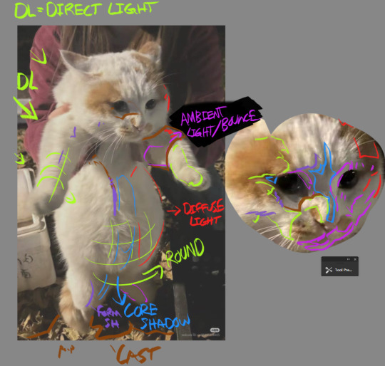
did this a while ago for fun. I recommend taking an image and doing something like this. Labeling what you see, how you find light is affecting the subject, how the environment is providing context.
one of my favorite stages of the art process is doing this to my own paintings, though I do it in my head. Following my light paths, checking the logic I set up and see if it makes sense. I do a lot of work from imagination, so it is important I know the logic and can effectively check my self and my work. With reference, because the light is found out for you, instead of directly copying, do the checking process in your head. The answers are true as it is a photo, though be careful as photos can be heavily edited so studying from life is the best way to check.
It is like algebra and being presented with a solved problem, and instead of copying it, you analyze and compare to your formulas
Finishing an artwork requires evaluation and correction. Starting an artwork requires you to develop context that logic must hang to. Throughout a render, responsibility is key. And patience!
That is how I think while I paint.
texture, angle, local color, environmental light and colors, circumstance of the material etc. are all important to understand when painting any subject. Yes light is essential, but so is perspective as said at the beginning.
I hope I have helped somewhat!
66 notes
·
View notes
Note
You've probably been asked this a million times, but how do you render? Or I guess a better question is how do you decide where to put colors because it's always so masterfully done!!!
For rendering, firstly: what is the mood I’m going for? For my Hero’s Shade piece, I kept the rendering rough, relying on rough brushstrokes and brushes with color jitter to create colored texture, and then leaving it alone before it becomes too refined. For my Zelda illustration, I kept it clean and dewy. I render based on intent, mood, and characterization.


To master rendering, I would suggest doing in depth texture studies. Below is an example of my student’s work where she’s in the process of doing this:

Mastering how to render different textures by doing exact studies from photographs of things such as: metal, fabrics, rocks, wood, etc will excel your rendering abilities.
BUT AND THIS IS SUPER IMPORTANT: the thing I notice about most artists with like godly rendering skills is that their rendering sometimes excels beyond their drawing abilities. Then they use their rendering as a crutch to carry their poor drawing skills: the drawing is like the bones, the architecture. If you have a poor drawing with excellent rendering, the piece will look good to the average enjoyer, but it will unfortunately fall flat to artistic peers.
In saying all of this: it’s super duper important to note that, when trying to make objectively appealing art, it has hierarchies of importance and I’ll tell you the order:
Perspective placement and proportion are the first part. It’s basically the drawing part! The architecture and bones of the artwork. The anatomy, the form, the silhouette, negative space, and overall design of the sketch, composition, lineart, etc, they all sort of fall under this.
Value is below this, and to master value I suggest master shading the sphere.

Highlight, direct light, core shadow, reflective tone, cast shadow, etc.
Color is below all of this. You can be wrong with color but not wrong with value is what’s usually said.
As for coloring, it’s a lot harder for me to explain other than to refer to how I use grays a lot. Color is a lot less step by step to explain you see, so I’ll try to explain, but I’m sorry if it lacks much sense! The reason why I’m able to get away with using strong/bold saturations without it being overwhelming is that I use the grays to carry the strong saturations. It’s important to remember that the human eye can get tired; it’s why we blink even when our eyes don’t feel dry. It’s a moment of pause, a moment lacking in stimulation. You have to have areas of high stimulation (high saturation, texture in rendering, sharp edges) paired with areas of low stimulation (low saturation, smooth rendering without detail, and lost or fuzzy edges). This is why I argue that art does indeed have rules, but only so much as our own brain and eyes have rules; it’s our brain and eyes that perceives the art, and our brains have a very broad and universal mode of operation. Same with art. That’s why art is objective and yet also subjective! But this is a tangent.
As for color, it’s again with mood, but I usually rely on contrasting colors more than anything: warm or cool for light or shadows, one is super saturated while the other is typically desaturated. Hope that makes sense! It’s all about balance: one element/color must have a foil to counter it. And when you chose your main colors, if you wish to add a few extra colors for dynamism, it’s your best bet to chose the colors right next to the main color you’re using on the color wheel. For instance, if you choose red and green as your color scheme, and you need more details in the green shadows as an example, use a combo of blue-gray variations to add more color and saturation variation. In contrast, for your red lighted areas, maybe I would use a light gray orange to introduce new colors in.
Idk if any of that makes sense, I’m not exactly the most gifted teacher when it comes to trying to break everything down, which is why I’m trying to learn how to teach 🤣 I’ll get the hang of it one day maybe 😆 Hope some of this helps answer how I personally approach it, and mind you it’s important to learn from actual masters who have been doing this for decades!
91 notes
·
View notes
Note
hello! I love your art, it's so cute, expressiv and dynamic! I'm wondering if you have some info about the process behind your painting.
It looks like watercolour which is what I'm interested in doing. I'm finding it tricky to find resources on watercolour anthro stuff - both because I'm inexperienced in watercolour but also cos resources I've found are mostly geared to realistic/traditional watercolour, not cartoony/fantasy stuff.
Watercolour for cartoonier styles looks great when there's some bits left white, which u do really well! How do you figure out where to paint and where to do the highlights?
Also I'm not sure of simple things like whether to ink or paint first, and how to approach sketches. Also what paper to use - I'm using watercolour paper but artists like Remy Boydell use Bristol board I think 🤔
I know a lot of it is experimentation and practice, but I'd love to hear some tips/resources from someone who knows what they're doing and does it well! Thank you for reading this long ask, and I hope you have a nice day :)
I haven't had much formal training in watercolor (I have in oil and ink) so unfortunately can't really link you up to any good tutorials. If you viewers at home have any then feel fee to comment below.
Nonetheless I think it's always good to start with some baseline of realism so you can figure out how light and shadow play on things like clothes and hair. The highlights are kind of just gut instinct that comes from experimentation, usually I'd leave a bit more white on whatever side the light source is coming from, plus a little more white to accentuate the more shiny bits like sleek hair, metal, polished stone, etc. I like having white wet gouache on hand too to fix things or add in tiny choice highlights.
I usually sketch and then go over it in a thin pen, let it dry then erase pencil lines, paint over it, then use pen again to add thicker outlines or details and some cross hatching for texture. The pen bleeds a little (I'm sure you can see in some of the art I've posted) but it's not always a bad thing if you can work with it. I'm sure that's not everyone's preference but i don't mind it.
I've recently posted stuff both on Bristol-like paper and watercolor paper. I actually do like watercolor paper because it has a nice texture but if you're really going for a clean, precise look more reminiscent of cartoon art then Bristol may be easier to work with. Honestly though looking back through stuff I posted I'm not sure theres a really noticable difference, at least with how I render things.
But yeah like you mentioned it's just a lot of studying art you like and experimentation. I posted some rabbit pet portraits recently and absolutely was looking at some Beatrix Potter art to reference what fur texture she used and anatomy.
71 notes
·
View notes
Note
Hii first of all, I FUCKIN LOVE YOUR ART! ITS GORGEOUS AND IM SURE EVERYONE CAN UNDERSTAND YOU REALLY GIVE YOUR SOUL INTO THAT🤧 Your color palette looks so good, What do you pay attention to when painting? (Like when do you think its better to use multiply or something like that and etc.)
first off, I'M HAPPY YOU CAN TELL THAT I PUT MY SOUL INTO MY ART!!! im genuinely in love with drawing and am always finding ways to make creating art enjoyable and impress myself with what i can achieve and learn :D
second, thanks for asking your question!! i dont mind answering it, but my response is quite long. here's my thinking process:
(you specified layer modes like multiply, so im gonna gear my answer towards that a bit) 1. REFERENCE SEARCHING IS KING. color is actually extremely hard for me, so i search around for artworks with palettes i'd like to use and study how an artist uses it. some situations i have a clear idea of what i want, but usually the images in my head are extremely vague, so i borrow palettes from various other artworks that fit the vibe of what i want. an example is this one. my main palette reference were from these artworks. im looking at this artist's use of high saturates and how drawings are overlayed on top of each other. while looking at references, im asking myself how is this artist using warm/cools, where are these warm/cools placed, if their illustration used any form of texturing (like halftones, hatching), how do they use their palette to render form/shape/gradient, when/where do they saturate/desaturate their colors. those questions inform my decisions when using colors too.
2. USING LAYER MODES WHEN NECESSARY. i used to be reliant on multiply for everything, which atp i dont do since i can definitely push colors more first before using layer modes. only when i feel like my current colors are lacking do i start tinkering with tone curves and/or brightness/contrast/hue/saturation/luminosity settings. and if that doesn't work, then i start using layer modes. using layer modes do help with achieving certain effects, color corrections, or when i want to fuck around and find out. i think having a better understanding of what these modes can do makes you more decisive on how you can properly utilize them and to achieve a particular look (like using multiply for a cel shaded style). here's an example:
this leads into my next point:
3. BALANCING OUT VALUES. big thing that makes an illustration hard to read is if values blend together which affects the hues and contrast. i check for what elements need to be distinguished from one another and if it can be read clearly. using layer modes can either help with this or not help at all. it's very dependent on the type of layer mode. here's this example where i applied pin light:

back to #2, there are various instances where i'm using layer modes for quick color corrections and/or to help with readability:


other times, i start off having my entire subject in gray and to figure out main shadow/lights (similar to the multiply cel shaded process i linked ealier). im thinking about what this should look like if i only used 2 value tones:


when in doubt though, i check my artwork in grayscale to ensure values aren't overly blended into each other, especially if i didnt start with grayscale like this one:

painting for me takes into consideration a lot of different aspects. im thinking about how colors should interact, where/when to give contrast, checking/balancing out values, etc, but im also making it a time to study off of how other artists use their colors through the references i collected.
hope this answered your question! lmk if there's more :]
#answered art process questions#answered asks#this one took me a couple of hours to form out my thoughts while editing in examples ngl
151 notes
·
View notes
Note
so sorry if you arent giving art tips; but how did you learn to draw poc hair?? i need advice and yours is so cool
Thank you! And I would really mainly recommend studying how other (POC) artists stylize hair, and simultaneously referring to photos of people of color for inspiration + understanding texture.
I think, it's all about the context of your style really. I learned a very looong time ago when I was a kid on how to draw curly hair specifically because I had big ol' curls myself + I was subconsciously studying hair styles of the like in cartoons or media I enjoyed!
The thing is, just don't overthink the shapes. At least for cartoony styles like anime, or one like mine where the texture mainly comes from the coloring + rendering, the structure can be super simple to follow if you don't overthink it.
^ Taking this newer WIP of my OC's really quick for reference! If you look closely, the shapes are mostly just little bumpy cloud-like chunky strokes! And while this isn't rendered hair yet, you can still read it as the texture it's intended as.
......................... ...

^ An older doodle of my other OCs to show other hairstyles.. While I draw braids + locs a smidge differently now, this was still composed of wobbly lines that I defined a bit with other squiggles! Not so hard I promise! And obviously, I can always do better + I will continue to study/improve.
Some artists I have been particularly inspired by when drawing textured & POC's hairstyles are here if you wanna check them out: southpauz / kidciitrix / p0nyplanet / xavier illustrates / likelihoodart / toorurii .. ETC.! (I love how they draw hair in general LOL it's all so good..) Hopefully this helps a bit!
285 notes
·
View notes
Text
perceptor wants to study you. afab!reader. nsfw! drabble. skirt mentioned.
Perceptor is a scientist. It is his job to learn. To observe. In many ways, when the situation calls for it, it is also his job to solve things. The most reliable questions to answer were equations, solid and truthful: numerical variables were tangible enough to pull apart and rebuild without straying too far from his reality. They only have one answer.
But you were different. A moving target that never stood still. Always changing and taking him by surprise. You were a blow to his ego. And that caught his attention. A beauty that had no source in his stout and unyielding world. The possibilities were endless.
He wants to drink you dry.
" Open your mouth."
His voice was barely short of a whisper. Do all humans have this ability to render sentient beings speechless, to rob the room of any sound? Maybe they are also capable of manipulating magnetic fields: of defying the laws of gravity to knock their opponents off their axis. That would be dangerous. It was a good thing that you didn't see him as a threat. Not when you were looking at his past your lashes, eyes coy — fingers drawing circles around his shoulders.
" My," You hummed, " How bold of you, Perceptor."
Have you always had this lilt to your voice? He searched his processor for a comparison — the water running down the creek back in your green organic planet, the lonely echo of bullets as they ricochet, the tentative hum of a spark as it reignites. None of them comes close. He feels sick. Dizzy. Maybe he needs to go and see Ratchet.
" Open your mouth, please."
He repeats himself. Voice surprisingly level, even though it felt like his vocalizer was going to snap. And that earned him a smile. He did nothing to warrant your laughter, and yet you indulged him like you always do. Tongue — pink and wet — peeking past the row of pearls you call teeth as you tilt your neck gently backward. His hand moved instinctively, dwarfing the back of your head for support.
He pressed the pad of his thumb flat across the soft surface and felt the metal sink. Your eyes fluttered shut, legs, slightly parting to let him slot his body in between. He held you in place. Chest to chassis, the thin fabric of your shirt did nothing to hide the subtle race of your heart.
Sinew and muscle, humming, unlike anything he's ever heard.
This is for science, Perceptor tells you, retracting his servos to pick up his PADD, mind bursting with a flurry of thoughts. He couldn't even remember what he wrote down. He will have to review it later.
He runs a few more exams. Medical needs it. And yet he had offered himself to run them. He says it was also crucial for his research.
What kind of research, Ratchet had asked him.
A personal one, he had replied.
No one stopped him, especially not when you were so eager to help.
He kissed you on the lips. Tentatively, once, twice. You sighed into his mouth. Lips soft. Too soft. He needed to know if you were just as delicate between your —
This is for science, Perceptor tells himself, already sinking onto his knees. You were a plethora of texture, so different from his biology. So far from the mundane. While he clings almost religiously to the dependable — facts, numbers, metal — the purest, rawest form of science is the unknown. He nudged your knees with his nose, wider, and you wordlessly complied.
Every scientist is an explorer at heart. And what is more unfamiliar than the feel of your skin?
Perceptor rubs up and down your thighs, feeling you shiver. His cooling fans clicked to life, reacting, responsive. And this pleased you. And you pleased him.
Prettiness is symmetry, all things in the right place. And yet you were an artifact of unknown beauty, with no origin, no source. All things have to start somewhere — stars were born out of gases, sparks out of a mass of positrons supercharged by energon. But where did you come from? So alien. So different.
If the Earth was your creator, then you must be molded out of clay, shaped by her gentle hands, not carved, for he was sure even under his touch you would break. That the slightest misplace of pressure would shatter and scatter you into pieces.
But humans were known to be resilient. He likes to call you generous instead. Ever so giving, ever so kind.
Today, you wore what you called a skirt. Isn't it pretty? He doesn't have much to say about its color other than that it was practical and worn with a purpose. An invitation.
You mewled in encouragement when he pressed a kiss square against the plush, wet slit of your cunt.
Perceptor is a scientist. It is his job to learn. To observe. In many ways, when the situation calls for it, it is also his job to solve things. And there is still so much he wants to learn from you. He wants to map every sensitive spot that made you gasp and writhe. He wants to chart every delicate twitch, every clench. And with your body arching atop his table — sweat dripping down your brow, you were his muse.
But make no mistake, this was a symbiotic relationship. You were also studying him, changing him. ( He was certain you've ruined him for anyone else.)
Perceptor knows he should have stayed as an objective observer, standing on the sideline. Yet you were a very seductive hypothesis, just waiting to be kissed to life. There was lubricant leaking down his chin as you reached your high, nails scratching the back of his helm. Objects cluttered off the table in the distance, yet he continues to drink.
You broke his idea of truth, and Perceptor lets you.
#transformers#transformers idw#the scavengers#perceptor x reader#perceptor#idw mtmte#idw transformers#maccadams#transformers x reader#transformers x you#tf mtmte#mtmte#transformers mtmte#mtmte x reader#mtmte imagine#lost light#transformers lost light#tf headcanons#tf imagines#tf idw#transformers headcanons#transformers hc#tf hc#lost light x reader#lost light au#perceptor transformers#perceptor idw#transformers imagine#transformers one shot
404 notes
·
View notes
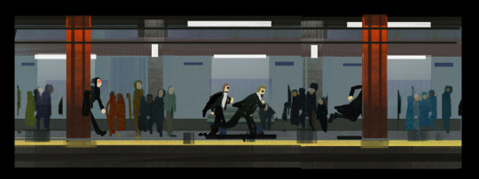
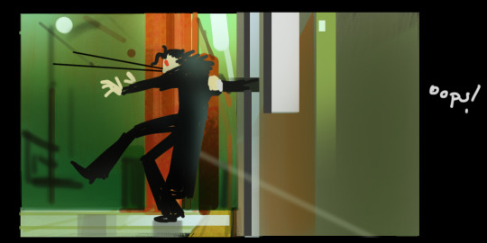
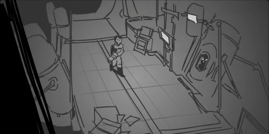
Note
HI I JUST SAW YOUR INCREDIBLE SHERLOCK AND CO COMIC YOU MADE AND I WOULD LOVE FOR YOU TO TALK ABOUT THE PROCESS AND THE SYMBOLISM AND INTRICACIES AND EVERYTHING PLEASE ‼️‼️‼️‼️‼️‼️‼️
GOD THANK U ok if i actually talked about EVERYTHING i would be here forever and ever, there were things about the process where it kept surprising me and i kept adding stuff.
I talk about my general comic process here , it started out mostly the same for this one. Analysis of the script, sketches, panel and colour blocking
The scene from Mr Sherlock Holmes presented me with a unique challenge (for me) because...usually I pick scenes from the podcast that are instantly visually stimulating. This scene is NOT that. It's sort of unclear and confusing and even the emotive narrative is sort of hard to pick out. Those things I had to sort of decide for myself. It's hard to draw a whole scene like this without first deciding what the scene is about, what its purpose is. If you go back and listen to the episode along with the comic you'll notice all sorts of changes and tonal shifts - that's because of me and my decision making.
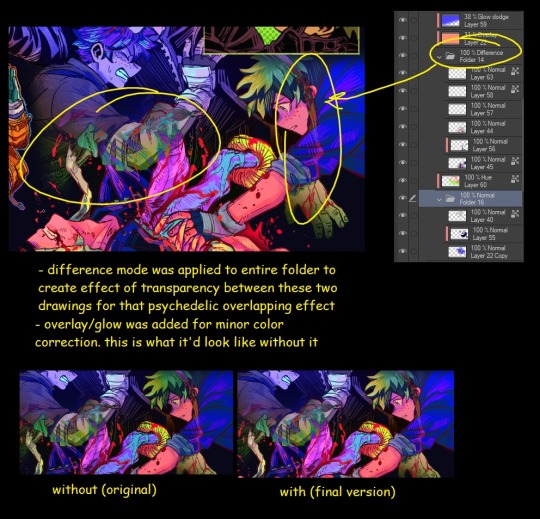
I decided that the direction I wanted to go in was to show John having his realization about himself, his podcast, and Sherlock, showing him getting pulled into, yes, Sherlock's world, but also the world of the podcast as an adaptation. I knew i could do this just with colour, but if you've seen my other comics, you know i almost always use colour to show shifts. I guess I had some insecurity about doing the same thing over and over again so I pushed myself to think of other ways I could accomplish it visual. Enter: rendering technique
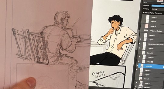
I will say I didn't expect this effect to make John seem so SAD and MISERABLE, i only wanted to show him getting pulled in, but its effective for his emotions in this scene as well. Scanning drawings into the computer sort of flattens the paper texture, so I started adding photos of the pages of A Study in Scarlet to make him feel more paper-y. And then, of course, realised i could use that to further elaborate on John's inner thoughts, backgrounds, and motivations. People are welcome to interpreted that how they like and i've seen a number of variations, but to me it operates on sort of a meta level, showing the inevitability of what John is going through. He's a Watson, he's always going to follow Holmes, he's going to try and figure him out, and that's why you sort of see a back and forth between acd and pod Watson, highlighting the ways in which they are similar, and then, John breaks off and becomes his own character, still with those foundations but also entirely different.
there's one piece of text that i haven't seen anyone pick up on or mention and I'm starting to think it's gone unnoticed because it's in an unexpected spot. I won't mention what or where because it is, for now, a very indulgent little secret.
I notice a lot of people are getting a kick out of Sherlock playing with the speech bubbles, which I am so pleased by because I almost didn't do it! I thought i was maybe breaking something in the comic but it was so fun that i didn't care and I'm so glad it came across well. It operates on a lot of levels, it shows his thought process, it plays into that fourth-wall medium play i've got going on, and it feeds into the web metaphor as well as visually showing him roping John in.
on the topic of Sherlock, I feel a lot of people are rather focused on John, which is understandable (he's the main event) but Sherlock has a lot of details I love too.
For instance, him pushing his hair back and putting on a coat when the officer arrives, almost like he's shifted modes, and then his hair falling back down when he gets excited and John starts to understand.

I really love this moment of Sherlock seeing John's potential for interest in mysteries when he's trying to solve the matter of what Sherlock Does, and being surprised and flattered for a moment (until John messes it up again)

John copying Sherlock's pose <3
There's deliberate things in the character design as well, things like the fact that once John comes into colour, it reveals that he's actually wearing more colour than anyone else in the scene, and the fact that the grey in John's hair only appears post-greyscale. Things you are welcome to read into. And there are, of course, the socks, which I've seen people pick up on.
Those are the main things for now so i might leave it there, but thank you so much for your ask and i'd be pleased to elaborate further on absolutely anything!
#sherlock & co#sherlock and co#thankuuuu i lvoe yapppingggg#seeing people pick it apart has been so satisfying and validating im so pleased with how it turned out and how people are reacting to it
69 notes
·
View notes